Error and information messages are the helpful guides
New users usually dare to venture out on a product’s journey without reading the onboarding message, online help, or any assistance.
Error messages and information messages should be like the best friends of users, who always understand, emphasize, and encourage users to use a product successfully. These messages must understand the users, their problems, helplessness, without judging or criticizing the users.
Let us see some interesting UX messages:
Problem
Dropbox has uninteresting and uncertain messages which do not build trust because, the messages talk about possibilities and not certainty.
They were not helpful to the user.
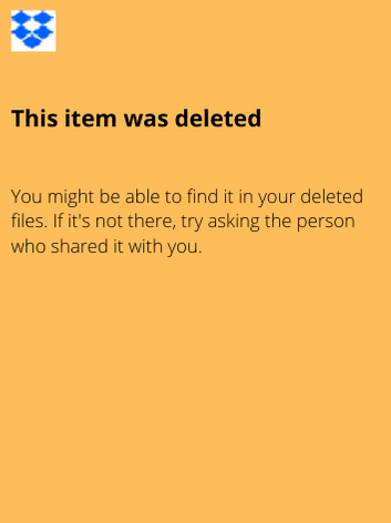
For example, a user deletes an item and now wants to find a deleted item. Dropbox shows a message:
"You might be able to find it in your deleted files. If it's not there, try asking the person who shared it with you."
Goals
Make the Dropbox's error messages really helpful, trustworthy, certain, clear, and interesting.
Solutions
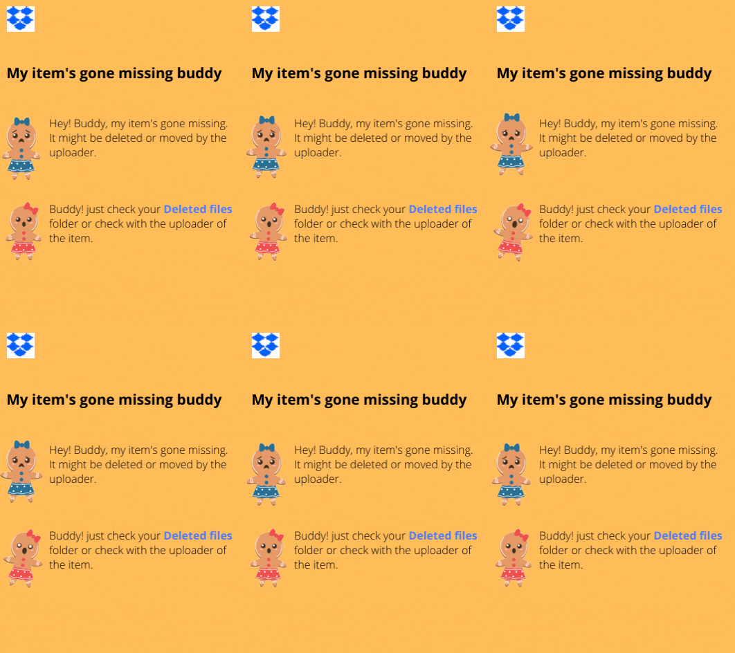
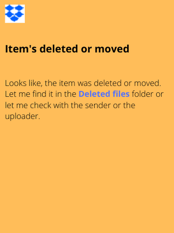
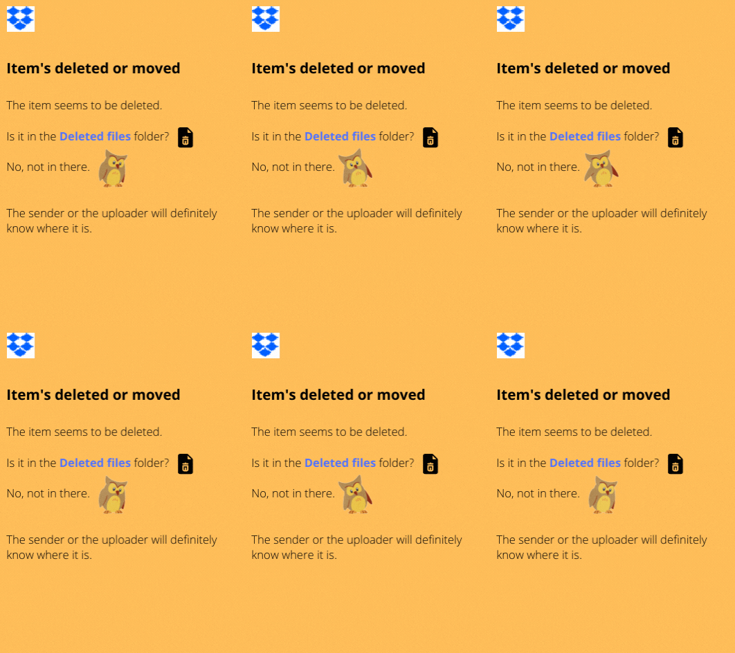
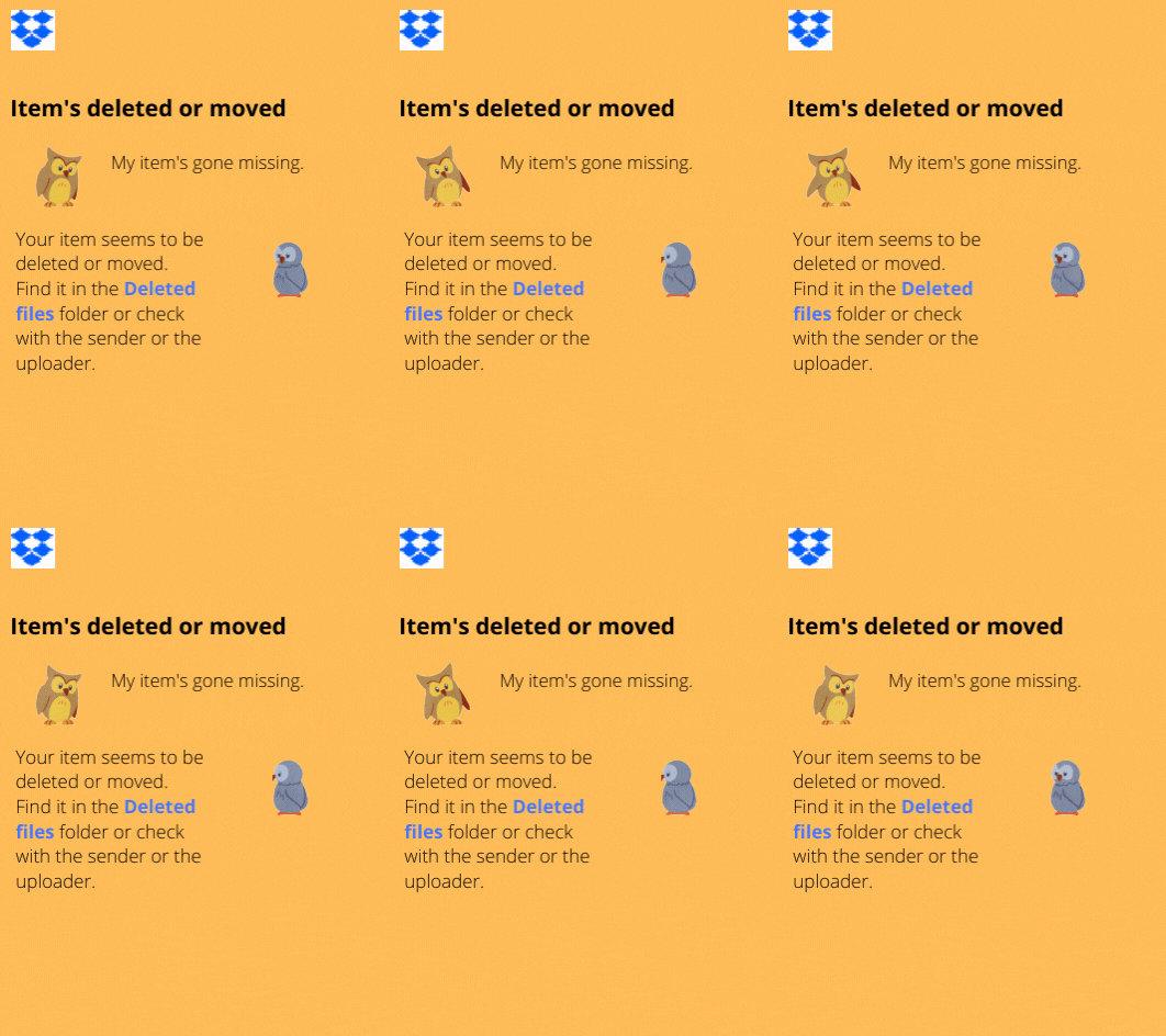
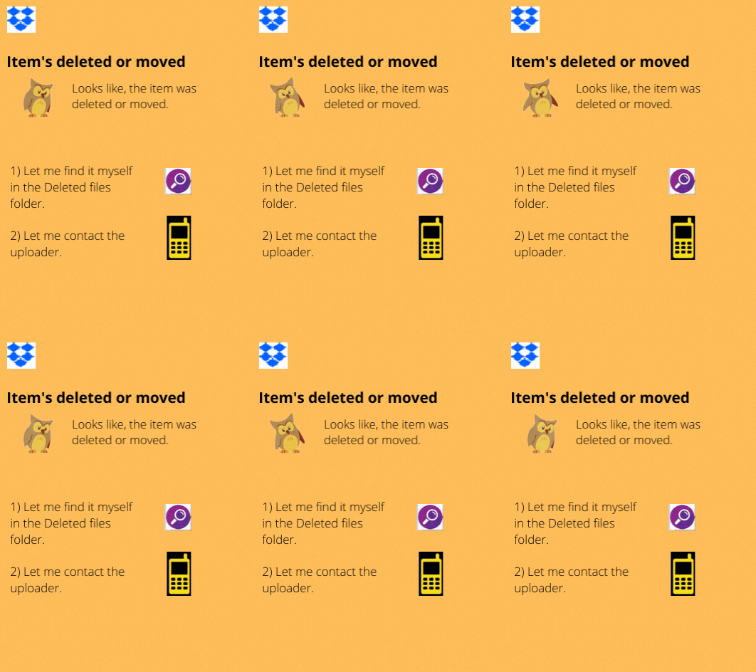
I recreated this error message in a conversational style using animated cartoon characters and also gamified it.
A LinkedIn web page is not available at the moment due to internet connectivity issues.
The original error message does not provide any solution, it asks the user to close the LinkedIn app. It describes the message from the perspective of a developer.
However, the updated error message provides clarity and even a solution.

